Anastasia Samoylova is a Russian-American artist who moves between observational photography, studio practice and installation. Floodzone points out the consequences of climate change in the southern United States, without the intention of making a visualization of disaster. Keeping her style, Anastasia made a book that is as effective as a good political speech which is not being labeled as such.
You are a multidisciplinary artist who uses photography a lot. Also you have studied Architecture and interior design. Was there a specific moment when you realized that photography was a medium you were particularly interested in?
In a way, yes there was. When studying architecture, I made many 3D models which I then had to photograph. I got very interested with what the camera could do with space. In its translation of three dimensions into two, photography both documents and transforms. I realised I was more fascinated with the image than with the architecture itself.
Can you tell us about your early stages of your new life and also the beginning of this project, back in 2016 when you moved to Miami?
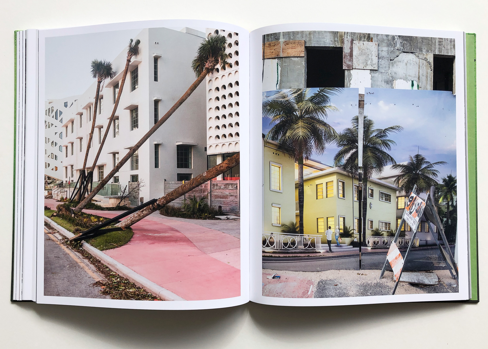
Miami has a reputation as a kind of leisure paradise – a place for visiting, not for living in. I soon saw that the familiar image of the place – which is the propaganda of tourism and real estate, basically – was very different to the reality. Miami is at the forefront of climate change. Hurricanes are getting more frequent and the sea level is rising. Everyone knows this but cannot quite accept it. My project FloodZone started from an interest in this tension. Would it be possible to make images that allude to it in one way or another?
In your Landscape Sublime series something that really impressed me is that you didn’t use photoshop for the constructions but you sculpted the images into a tableau. Leafing through the images of FloodZone, I can feel the same quality, that one of your intentions was to create visually the third dimension in a two dimensional medium. Can you elaborate on this?
It’s great that you saw the connection between Landscape Sublime and FloodZone. Both projects are certainly concerned with the pervasive nature of images, and how they shape our understanding of place and space. Having been working in the studio I wasn’t expecting to go out into the world and make observational images. But I found I was in a place that often felt like one of my studio tableaux! Miami is such an artificial place. It is full of images of its ideal self. Like a real-world collage. And when there are no actual images to see, the mind fills up with them. It’s hard not to look at the place and recall the countless representations one has seen. So yes, both projects approach the psychical phenomenon of ‘image overload’ but in different ways.
In his essay for the book David Campany enlightened us by mentioning this principle about your work: “One can try to avoid the clichés, or one can push through them and emerge on the other side. This seems to be Samoylova’s approach.” What was your way to achieve that?
David is a wonderful writer, I think, and he understood what I was trying to achieve, which was to accept the visual clichés, to go with them, and to come to an understanding of their power. Through that, I was able to get to a position where I was making images that were not simple-minded critiques or inversions of the clichés, but were layered and complex meditations.
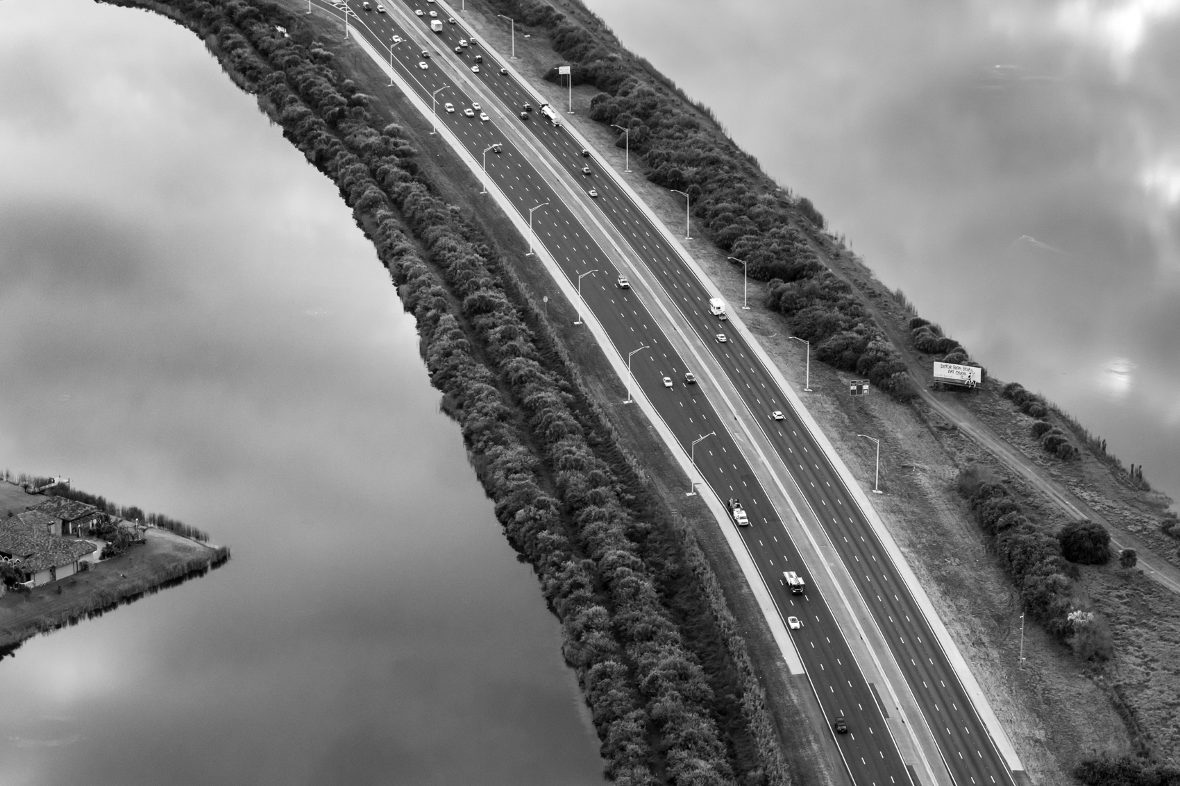
FloodZone is structured by 69 color and 17 black-and-white photographs, which to some viewers may come as a surprise. What was the criteria to make the black and white ones?
The decision to use black and white came about in the editing process. As well as writing for the book, David Campany helped to edit and sequence it. Most of the photographs are color vertical pictures, often of small but significant details. We decided to use the horizontal photographs of the topography of South Florida – many of which were shot from a helicopter – in black and white, as visual punctuation marks, but also to locate the viewer. From there we also decided to use the occasional vertical picture in black and white. The reasons here were partly aesthetic, partly to do with the flow of images in the sequence, but also its another layer of mediation that keeps the viewer alive to what it is they are actually looking at.
You have presented FloodZone in gallery shows, and it has been published by one of the most respected publishing houses, Steidl. What do you enjoy most, exhibitions or books?
The FloodZone exhibitions have been an opportunity to reconnect with my architectural thinking, using diagonal panels of color to complement the photographs but also to create a total environment in which image space and real space overlap and inform each other. Making a book is very different but the idea was similar – to make the form, structure and sequence of the book very immersive, so that one image or motif informs another, and suggests something else along the way. Arguably photography sits more comfortably on pages than walls, but I’m committed to both and have always enjoyed the way the specificities of the book form make me think about the specificities of the gallery space, and vice versa.
Which was the stage of creating this photobook that you enjoyed the most?
Developing the format and sequence was great fun. That took more than a year. But visiting Steidl in Germany for the first time was an amazing learning experience. Gerhard Steidl was fantastically receptive to the project, and being able to see it through from the design stages to the printing was a privilege. The final book is almost exactly what I had imagined it.
What are you working on now?
Well, currently, I am in Covid-19 lockdown with my son. For a few years I have been working on a series titled Breakfasts. I tend to look at photo books for inspiration in the morning, and I often photograph them surrounded by the accoutrements of breakfast – coffee cups, fruit, pancakes, juice, silverware. These images are fond homages to the photographers and photographs I admire. They are also a way of coming to terms with the ‘heroes’ so I can move on in my own direction. Plus of course, Breakfasts has a certain continuity with Landscape Sublime and FloodZone. All three projects are concerned with the effects that images have upon us. So for the moment my breakfast table is my studio.
more on her website.


