Monty Kaplan is a photographer from Argentina. His work can be interpreted as a subjective anthropological exploration of the world. The series Nocturno can be seen as a blank canvas where Monty illuminates eclectically parts of his private universe.
What do you think about the relation of peripatetic life and the action of photographing?
This is a very interesting question. I think there’s always a search to cultivate one’s eyes and for that you do need a change of scenery. Of course you don’t have to be drastic about it and move to another continent, you could also just move around the city you already live in. But what a peripatetic life does give you, is the chance to live new things. When i talk about cultivating one’s eyes, I don’t just mean what you see, but what you experience. Every photographer creates from what’s within them, we all react to our context. So in that sense, to change one’s context is to give more depth to the work produced. There’s never a danger to see too much, or try too many different things. Every single new experience changes you in one way or another and that all gets poured into the photos. That being said, i think it can get weary. You can start to feel detached, because one thing that’s usually not taken into full account of a real nomad life, is that it can strain relationships. Even nowadays with all the technology at our disposal, there’s nothing like sitting in the same room with a friend, with a lover. So in a way, the danger of a peripatetic life is to become sort of solemn after a while, it’s not fun to be alone. It can get sad. And that will ultimately translate into uninteresting work, because if you’re not having fun, you are in no shape to take good photos.
Why did you decide to use black & white instead of color in this series? This can be supposed as a cliché question, but I take into consideration the extensive use of color in your work.
Well, there are a number of reasons for the b&w. Even though i do have an extensive use of color in my body of work, black and white has always been my first aesthetic love. I can’t say I favor it over color, but there’s a different connection to it.
I grew up watching Noir films, I must have seen the likes of “The Maltese Falcon”, “M” and “The Big Sleep” about a billion times each. Something about that contrasty shadowy look has been permanently engraved in my head.
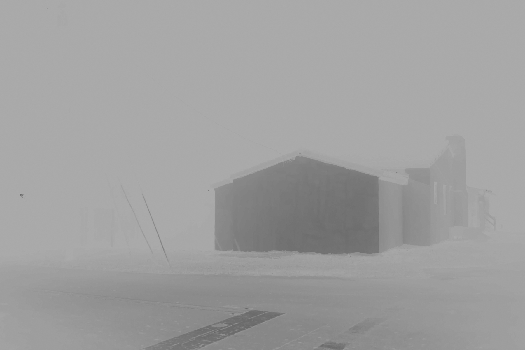
But beyond my personal feelings to it, there’s a also a reality about b&w which is it helps to abstract a photo, in both space and time. It strips away information, and that helps a lot to have a more visceral initial reading to it. When I started working on this series, there was a real eager to experiment with distortion and destruction of the image. And in that sense, the b&w helped immensely, because it has this elegance and classic vibe to it. Color experimentation can sometimes be real messy. It can end up looking too trashy, too unappealing. And you certainly don’t want to elicit that onto the viewer.
So b&w gave me the chance to experiment and abstract, but keep a harmonic order to it, which is something the project really needed, being an eclectic and often disjointed material.
Could you tell us more about the sequencing stage of the photographs? I like the fact you avoid the typologies, creating a flow that brings together different viewing angles-like a night-walk feeling.
Oh the sequencing was a nightmare. I mean, I ended up having fun with the process eventually, but there was so much material. We’re talking about an accumulation of five years of night walks. And I went out, every night. So needless to say there were a lot of different versions of it. At the beginning it was a more straight forward style deal. But just as you say, I made a very conscious effort to try and stray from the obvious and from the norm of how a “series” works, how it’s narrative is structured. I knew I wanted it to feel different from the things I was seeing happening around me.
So yeah, there’s this element where you’re seeing a picture of a window from a city like NY and then suddenly you’re in the middle of a cemetery and it looks like you dropped straight to hell from one picture to the next. In that way the sequencing was vital, to help make it feel unpredictable.
What is your way of presenting these artworks in natural size?
Well actually right now i’m deep into work of a book for the project, and we’re trying out different papers and styles of printing. In my head it’s always supposed to feel sort of like chalk, or like old newspaper ink, that would leave your hands black.
As for the size, I decided to go with a somewhat weird dimension, at least for a photo book that is, which is that of a vinyl album. It started as an in-joke with a friend who had seen the finished series and said that all of the photos looked like they could be the cover of a Dark Metal album. We both laughed and agreed. The idea got stuck in my head and after a while I couldn’t think of it in any other way.
A couple of photos were also part of an exhibit with Open Doors Gallery in London, and for those we used a Giclee print on Hahnemühle Photorag paper 308gsm which gave it a very interesting feel.
Do you listen to music while editing your series?
Oh yes. And for this one I actually used something very personal as a background for the editing, which was the original score that my friend Mateo Yaya made for my unreleased first feature film “Ekduo”.
Before I became a photographer I was a filmmaker and I shot this film which was just scattered with problems, mainly because of lack of funding, and it became a total mess. But the score that Mateo did was so rich, layered and beautiful, to this day I always say it was the best thing about that dead project. I’m always thinking of releasing the tracks as an album with him, but it just hasn’t happened yet.
See more on his website.


