Bertrand Cavalier explores the interactions between people and their environment. Exploiting photography’s ability to penetrate the tissue that binds individuals together and embeds them into their surroundings, he creates poetic renditions of singular moments, rather than objective documents of social phenomena. Cavalier’s images reveal how the socio-political order informs everyday life through architecture and the urban landscape.
When and where did you get your political consciousness from?
As a young adult, I became critical toward my hometown’s city planning, Montpellier in the south of France. The first thoughts came in high school when I saw friends of mine crossing longer distances to go to school because they were living in the outlying districts of the city.
I have a bittersweet feeling about Montpellier as mistakes from the past just keeps being repeated. The municipality built in the 60’s a large social housing district in the outskirts – La Paillade – which came with the social inequalities often provoked by this kind of housing project. Nowadays, they keep developing rapid and cheap housing as they want the city center to reach the seashore. The recent construction looks fancy but in my opinion it lacks architectural qualities as one can see degradation after only a few years. The city grows very fast and I’m quite pessimistic for the future as it feels there is no care for how people will experience life among those places.
I think my work finds its roots from the observation that cities are sometimes hastily built while they compose our public space and define new ways of living.
Public space doesn’t only reflect the past but also reveals its current structure which is limited according to several studies for public space in Europe, due to excessive commercial activity. How do you imagine the future of public space in the 11 European cities that you photographed?
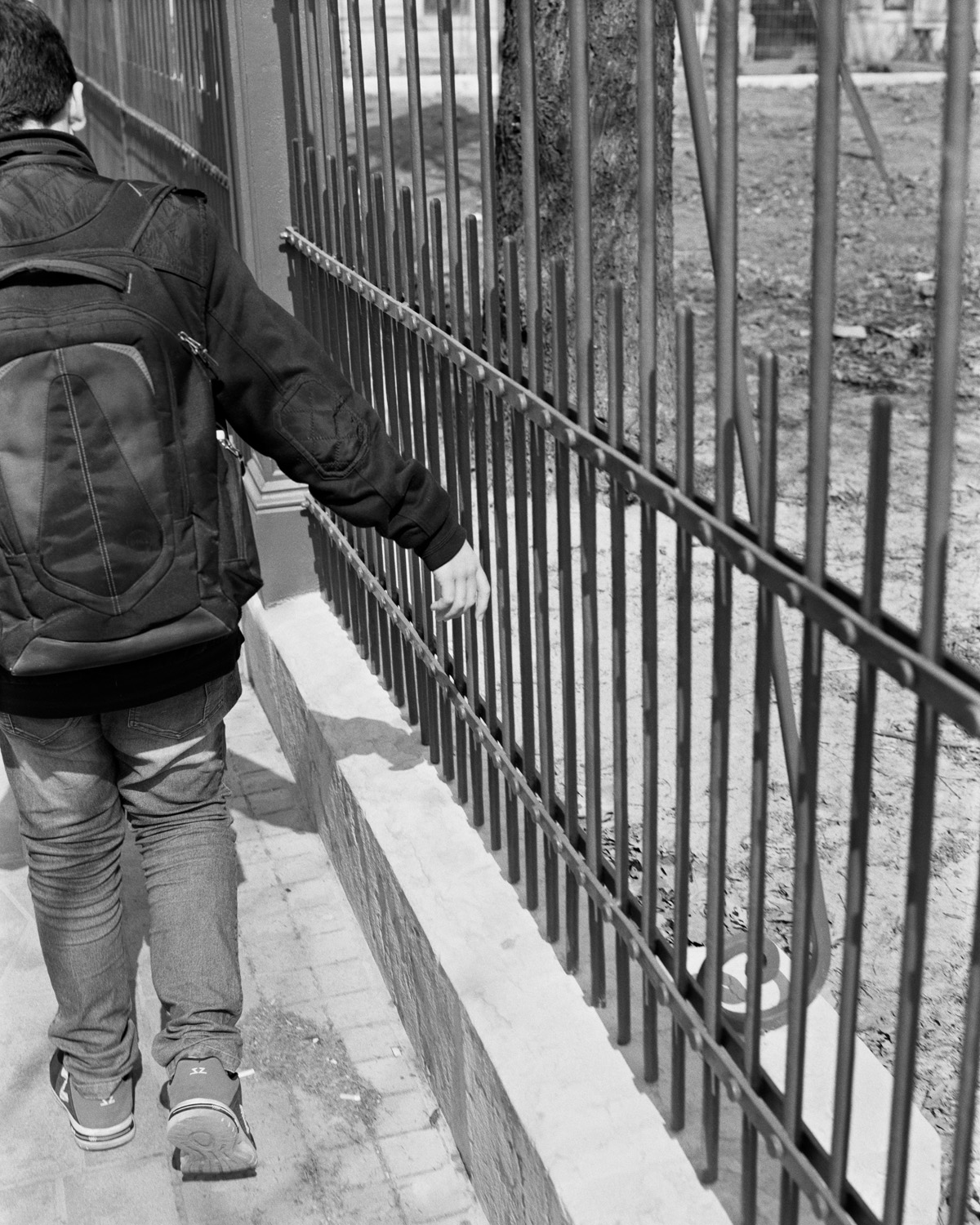
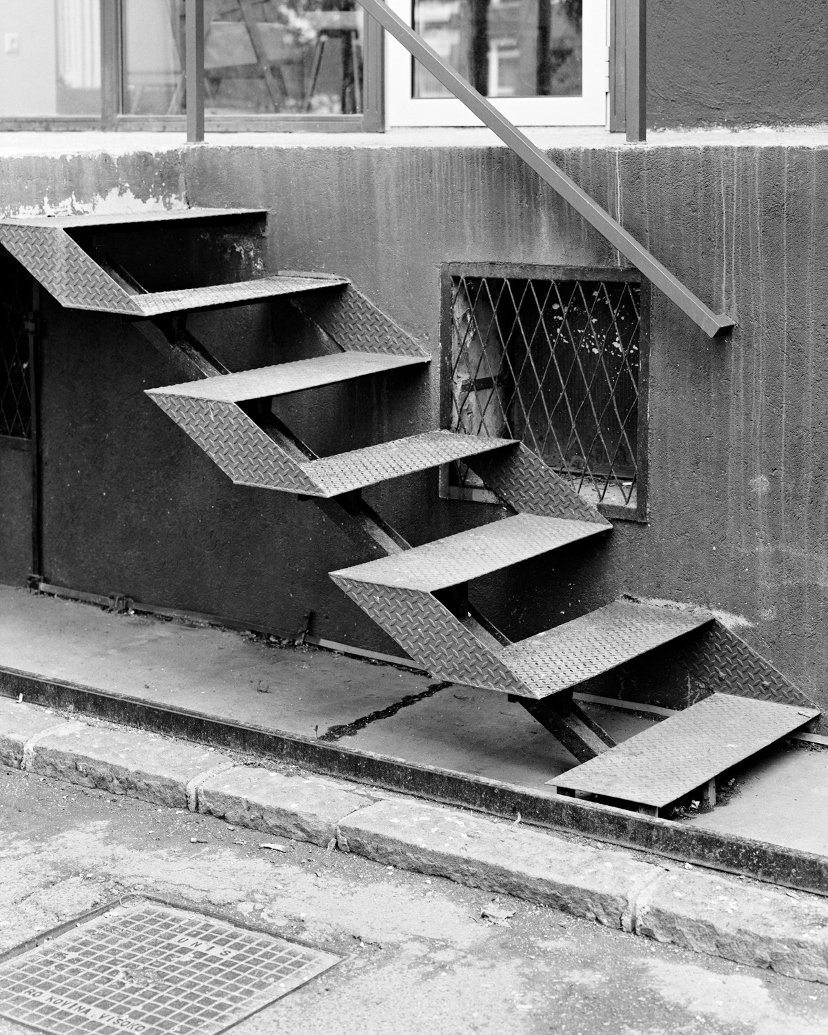
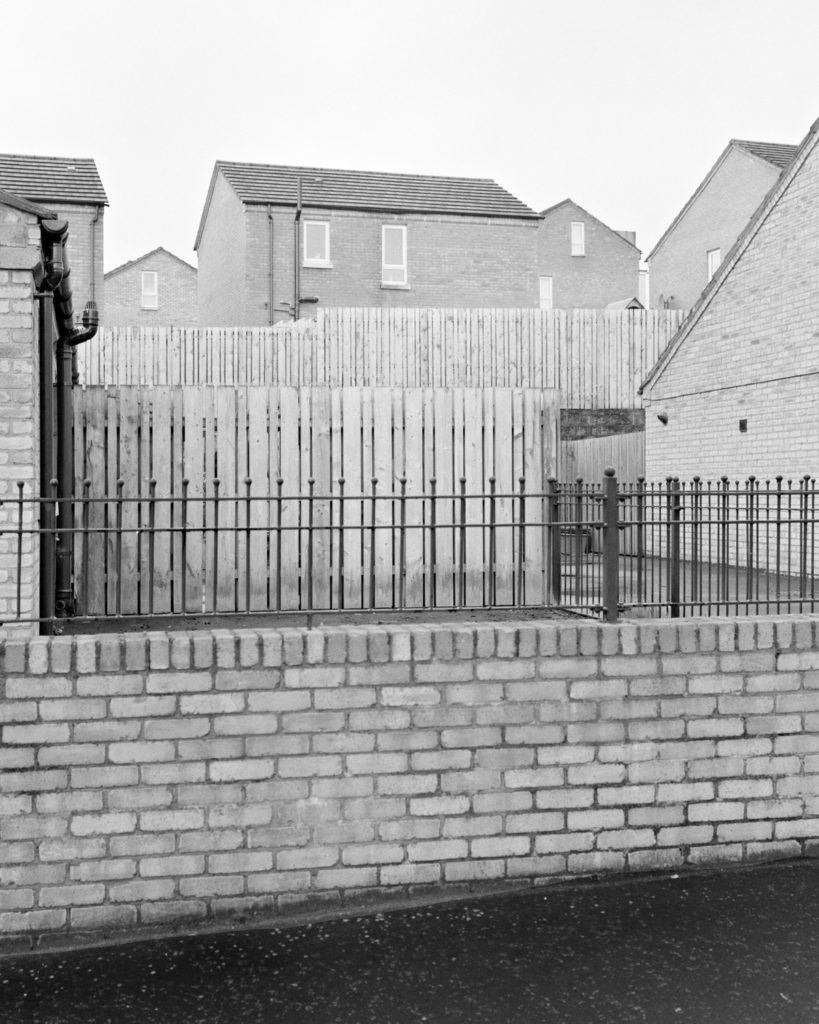
To give a bit of context, Concrete Doesn’t Burn was photographed from 2016 to 2018 in eleven cities which experienced important armed conflicts. The intention is to share thoughts about how history is lying within architecture and familiar aspects of urban spaces. Each city that I visited (Berlin, Rotterdam, Sarajevo, Belfast among others) has a specific history and a different way to respond to the past events.
In Belfast, I felt defensive architecture was still dominant in some neighborhoods and I believe it must have an influence on the people living there. In Rotterdam, it’s quite the opposite. The city has been heavily bombed during WWII and they had to rebuild almost everything. On the top of that, Rotterdam is a modern city, architecture is taken very seriously there. It feels special to observe an architect’s work on almost every building. Another strong example would be Sarajevo where cemeteries and bullet holes are so numerous that they constitute the citizen’s daily landscape and an important reminder of the past.
In conclusion, each experience was unique and I can’t find a single answer. That’s why the series is mixing all the photographs without mentioning where it has been made and what we are looking at. It belongs to the viewer to make up his own mind within the context of the work.
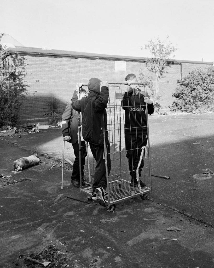
Another key element in your work is the portraiture. Rather asking you about what their presence means, I prefer asking you about your communication with them.
I love to collaborate with people and the portrait is one of the results. When I work on a series, it happens that I see someone or a situation that I find relevant for the ideas I’m developing. I always ask permission and explain what I’m working on. It’s essential for me that people understand what they are contributing to.
After that first step, if they agree, I just tell them to keep doing what they were doing. One might think that my presence could have an influence on what’s happening, however, getting to know each other helps to keep things natural. It’s important to not behave like an observer but rather as someone who’s joining the moment.
Most of the time, people don’t mind my presence and it happened that I spent a few hours with the same person. Last thing I do is to ask for an email address, and I always send a selection of images. Most of the time, I get responses and people are delighted to receive the images.
Photography, as all mediums, has its limitations. Why do you think that it worked well as a tool in your case?
The constraints of the real is what I love about the medium. The beginning of a project is always very challenging as I have to define both ideas and photography. It’s also part of who I am to enjoy constraints as a working context. Rather than asking myself what I can do with photography, I try to understand what I’m really interested in and it gives me a lot of freedom to develop ideas.
“One might think that my presence could have an influence on what’s happening, however, getting to know each other helps to keep things natural. It’s important to not behave like an observer but rather as someone who’s joining the moment. “
Could you tell us more about the sequencing/editing stage of the photographs of this series? Do the white pages work as pauses and why? How did you decide the perfect timing to put down the camera and publish the work?
I’ve been very selective with the editing, especially since the photographs are gathering different layers of meaning. I believe this photographic approach allows me to work with sensation rather than facts. Therefore, sensation works as a powerful component of the series that can also be found in the sequence and the book design. Rather than providing information to the spectator, I’m triggering his own knowledge and experiences of European cities.
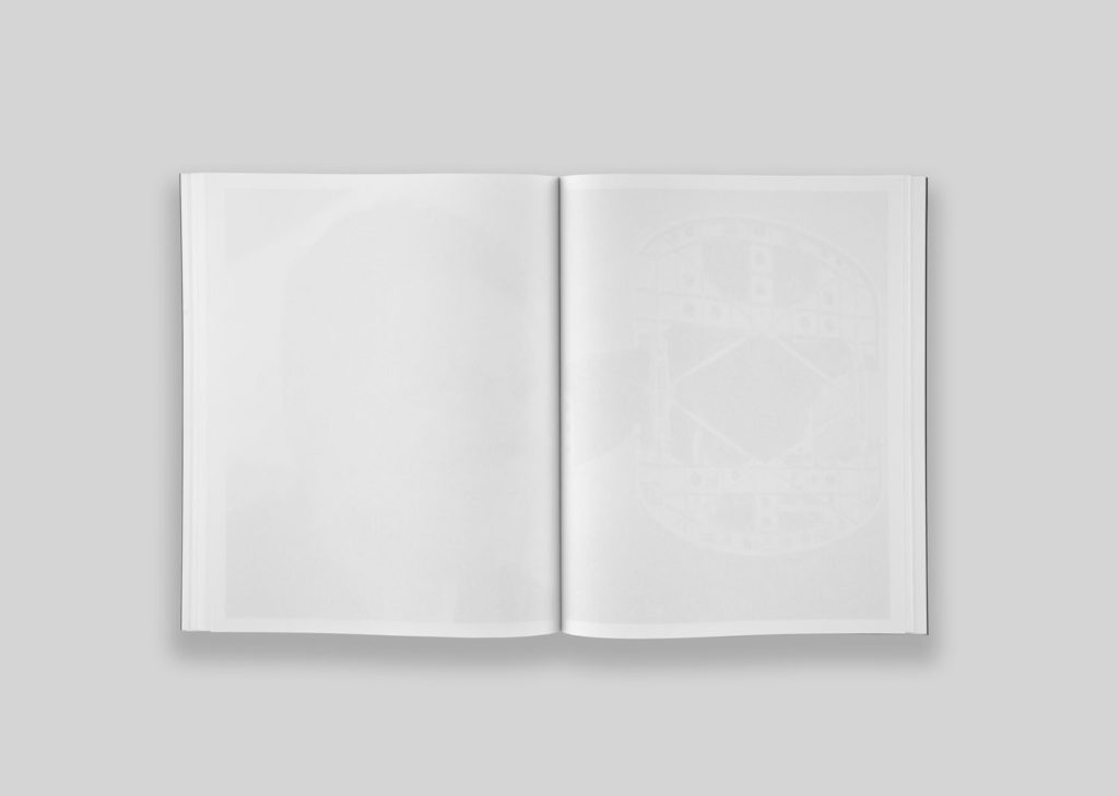
The white pages work in different ways. There is of course the idea of rhythm, but they can also refresh the reader’s look between each photograph. They also support the idea of a radical black and white object, but more importantly I like to see them as an evocation of presence and absence. As the paper is not a fully transparent paper, the architectures are more or less visible through the white pages depending on the inks. One can wonder about the ever absent or the ever present history / architecture.
After two years of intense work and travels, I had enough material to work with. I also visited enough cities which brought different kinds of conflicts and periods in time. I didn’t feel the need to go on forever, especially because the work is a personal point of view.
Could you share some thoughts on the decisions you made with the Fw:Books publishing house for the book designing, binding, paper?
When the photographs and the sequence were ready, it was clear that I wanted Concrete Doesn’t Burn to be published with Fw:Books, particularly for graphic design reasons. I think Hans Gremmen, in terms of design, finds raw but elegant solutions for books. It’s a duality that I find full of meaning and I wanted to have the same resonance within the publication as an independent object. Hans and I agreed on the structure of the book, after which, he elegantly brought together the ideas for the final version of the publication.
Do you enjoy more seeing Concrete Doesn’t Burn in its book form or in the shows?
I love both equally. The exhibition is the opportunity to challenge oneself and to propose something specific to the place and the work. I try to not repeat myself and to always find the right tone for the scenography. Though, it’s not an easy task and it demands to try different things until the proper solution shows off.
On the other hand, the book feels very special as it has a fixed form. I remember when I opened the box containing the finished book, I was beyond happy. I didn’t have to open the book to feel that it was right. The format and the cover instantly shared the feeling I was looking for. I’m glad the decisions made for the book resonates fully with the content of the work.
Why did you choose the black & white medium?
Monochrome skips different sorts of information and supports the project to be radical. It’s raw and simple, it feels to me like getting rid of unnecessary details to reach the essence of the subject matter. In the series, black and white can also be seen as an evocation of the past, as it blurs the line toward whether or not we’re looking at archival or contemporary images.
One last thing, in your art making or perception of art in general, what would be the biggest difference between the early stages of your career and the present?
When I was younger, I was trying to get acquainted with every photographic work I could find. I really felt the urge to explore the medium in order to understand it fully. Today my interests are still broad but I’m more selective. It’s probably because I try to focus better on my work and on questions which are driving my artistic practice.
More on his website